Baffle adds an animated obfuscation effect to any text. Reload page to see effect. Apply these baffling classes!
Baffles once upon page load
Baffles once, but for a longer duration (3 seconds)
Baffles for a prolonged period
Baffles endlessly
Tumble text characters either forward, backwards, or both! The tumble animation starts upon page load.
Classes
.tumbletext - apply to any text element
.forwards - tumbles all characters forward
.backwards - tumbles all characters backward
.mixed - combines both forward and backwards, alternating characters
EXAMPLE: .tumbletext.mixed
TIP: Make sure there is at least 1em of padding on the bottom of any parent element that contains tumbled text.
Truncate a paragraph of text to a preset number of words. Even if there are a fewer number of words, an elipsis (...) will be appended to the end of the truncated text. Apply any of these classes to any text to truncate.
Lorem ipsum no facer prompta vim, movet ubique qui ei. Per no regione aliquid, ea mei nulla scribentur liberavisse. Vim cu tale ludus possit, discere suavitate nam ad. No verterem reprimique vix, phaedrum hendrerit an quo. Qui feugait apeirian ut, ne virtute numquam mandamus mea. Eos et enim dicant deterruisset.
Lorem ipsum no facer prompta vim, movet ubique qui ei. Per no regione aliquid, ea mei nulla scribentur liberavisse. Vim cu tale ludus possit, discere suavitate nam ad. No verterem reprimique vix, phaedrum hendrerit an quo. Qui feugait apeirian ut, ne virtute numquam mandamus mea. Eos et enim dicant deterruisset.
Lorem ipsum no facer prompta vim, movet ubique qui ei. Per no regione aliquid, ea mei nulla scribentur liberavisse. Vim cu tale ludus possit, discere suavitate nam ad. No verterem reprimique vix, phaedrum hendrerit an quo. Qui feugait apeirian ut, ne virtute numquam mandamus mea. Eos et enim dicant deterruisset.
Lorem ipsum no facer prompta vim, movet ubique qui ei. Per no regione aliquid, ea mei nulla scribentur liberavisse. Vim cu tale ludus possit, discere suavitate nam ad. No verterem reprimique vix, phaedrum hendrerit an quo. Qui feugait apeirian ut, ne virtute numquam mandamus mea. Eos et enim dicant deterruisset.
Lorem ipsum no facer prompta vim, movet ubique qui ei. Per no regione aliquid, ea mei nulla scribentur liberavisse. Vim cu tale ludus possit, discere suavitate nam ad. No verterem reprimique vix, phaedrum hendrerit an quo. Qui feugait apeirian ut, ne virtute numquam mandamus mea. Eos et enim dicant deterruisset. Odio putent discere cu vim. Oportere disputationi ea mea. Per civibus constituam et, an feugait omittam mel, no suas quas doming qui.
Fittext makes any text aggressively responsive, and scales the text in proportion to the window width.
.fittext - Best scales text to fit within container.
Brutalist Framework 2.3
.fittext-c - Compress scaling of text size.
Brutalist Framework 2.3
.fittext-cc - Conservative compression of scaling text.
Brutalist Framework 2.3
.fittext-x - Expands scaling text aggressively.
Brutalist Framework 2.3
.fittext-xx - Extreme expansion of scaling text!!
Brutalist Framework 2.3
Warp your text into curves, spirals, circles, and waves! Works best on paragraphs. All are fully responsive.
Apply these classes for these effects.
.arc-text
Arc Text allows you to create a responsive arch of text!
.bezier-text
Bezier Text allows you to create curvy responsive text!
.circle-text
Circle Text allows you to create a responsive circle of text!
.wave-text
Wave Text allows you to create a responsive wave of text!
.spiral-text
Spiral Text allows you to become sucked into another dimension! It is fully responsive, too!
Add a glitch effect to any element! Works on images and text, or even entire areas!
Glitched Circle Image

Glitched Paragraph
This is a rather glitchy paragraph. You could even baffle all your firking enemies!
A more aggressive glitch effect than the above.

Blink is back! Apply theses classes to blink any element, even entire areas!
ALERT!
ALERT!
ALERT!
////////
WARNING!!!!
////////
Here is a fast-blinking span and image:

Get Your Blinker Fluid NOW!
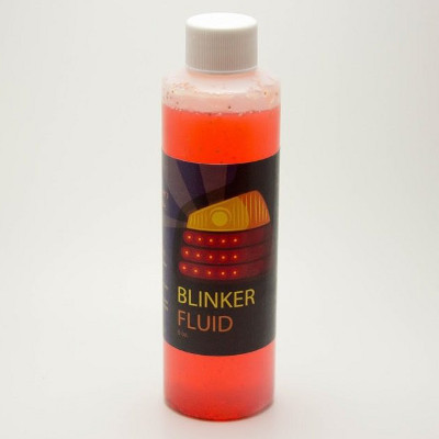
Get Your Blinker Fluid!
Apply a throbbing, pulsing effect. It's CSS-based, so no javascript is needed. Simply apply this class to any element:
.throb

.throb-throw

Spin any element constantly. Apply these classes:


Rotate Text allows the rotation of text within an element.
Rotate Text requires javascript, and the markup uses data attributes to configure the settings. You will need to apply a unique ID to each individual Rotate Text element. The markup is as follows:
								<div id="rotate-text-1" class="rotator" data-rotate-interval="3000" data-rotate-animate="fadeIn,rollOut">

								<p class="rotate-arena"></p>

								<ul>

								   <li>First Text Phrase</li>

								   <li>Second Phrase of Text</li>

								   <li>Last Text Phrase</li>

								</ul>

								</div>
Rotate Interval = 3000 = 3 seconds until next rotation
Rotate Animate - There are numerous animation styles supported. Consult animations.css.
Equal heights makes boxes the same height within a multi-column layout. In the example below, notice how all 3 column boxes have the same height.
.equal-height
Column One
This box has 2 lines of text
Column Two
This box has several lines of text.
Some small text.
Another small text line.
Column Three
This box has 2 lines of text
Apply these classes to add an animated gradient background to any element!
Let's get ready to rumble!
Brutalize any element by making it rumble! Simply apply the following classes to any element.
Stop Constant Rumble
By applying these classes together, users can stop a constantly rumbling element:
.rumble.strumble - rumble constantly, stop upon click
.rumble.sthrumble - rumble constantly, stop upon hover
.rumble
Constant rumbling!
.prumble
Pulse rumble, constantly
.drunk
Aggressive constant rumble
.hyper
Extra aggressive constant rumble
.crumble
Rumble constantly on click
.trumble
Triggered rumble on click for only 1.5 sec
.hrumble
Rumble upon hover
.mdrumble
Rumble on mousedown
.caffeinated
Aggressive rumble on hover
Blenders allow text or any other element to blend with its background.
NOTE: Apply only one class per element. Combining multple classes together isn't possible (except unblend).
In the example below, we use a blue box with white text and apply different blender classes to each.
Classes
.lighten-blend
.darken-blend
.hue-blend
.sat-blend (saturation)
.lum-blend (luminosity)
.color-blend
.dodge-blend
.burn-blend
.diff-blend (difference)
.exc-blend (exclusion)
.soft-blend (soft light)
.hard-blend (hard light)
.overlay-blend (inverted hard light)
.multi-blend (darkens element)
.screen-blend (lightens element)
.unblend (removes blend from current element)
.color-blend
.diff-blend
.dodge-blend
.multi-blend
.exc-blend
.screen-blend