BUTCH
Brutalist Utility & Typography Class Helpers
General-use classes for typography style, layouts, and page elements.
General-use classes for typography style, layouts, and page elements.
.arial
.arial-black
.comic
.tahoma
.helvetica
.impact
.verdana
.courier
.lucida
.georgia
.times
.palatino
.normal
.bold
.heavy
Normal size text
.fineprint
.smaller
.larger
.huge
Flow-text makes your text responsive! The font size uses media queries, so it scales depending on the screen width.
This is a paragraph without flow-text applied.
.center
.left
.right
.justify
rtl (right-to-left).
.wmv - Vertical writing-mode.
.spread - Adds 3px between characters
.oblique - Slants text
.allcaps - Capitalizes all characters
.lowercase - ALL LOWERCASE
.capitalize - All words uppercased
.smallcaps - Small-caps font is displayed
.spaced-2x - Double spaced.
.spaced-3x - Triple line spacing.
.spaced-4x - 4x line spacing
.tal-l - Left-aligns last line of text
.tal-r - Right-aligns last line of text
.tal-c - Centers last line of text
.tal-j - Justifies last line of text
.indent - Indents text by 1cm
.nowrap - Text will never wrap to next line.
.ws-sm - Small word spacing.
.ws-md - Medium word spacing.
.ws-lg - Large word spacing.
.wb-keep - Word breaks are prohibited between pairs of letters.
.wb-all - Lines may break between any two letters.
.ww-break - Word wrap allows unbreakable words to be broken.
.guard - Prevents text from being selectable.
Fluid-text is similar to flow-text in that the size scales in relation to the screen size. However, it does NOT make use of media queries. Rather, it uses a calculated scale range to determine the font size. Done in pure CSS!
.fluid-text
Address
Address Line 1
Blockquote
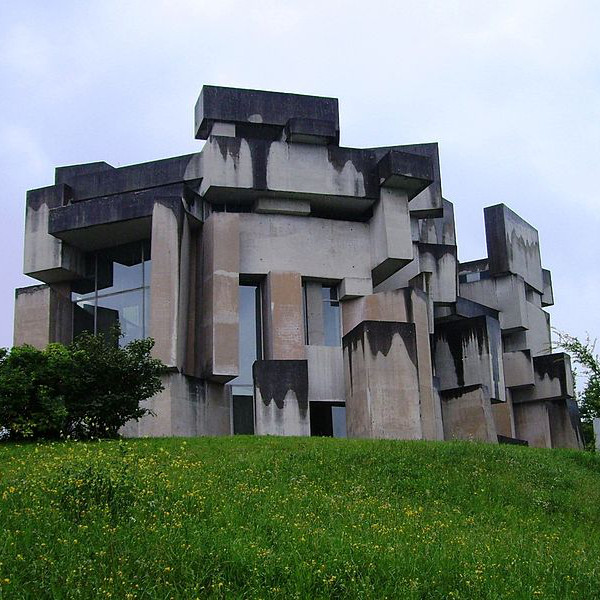
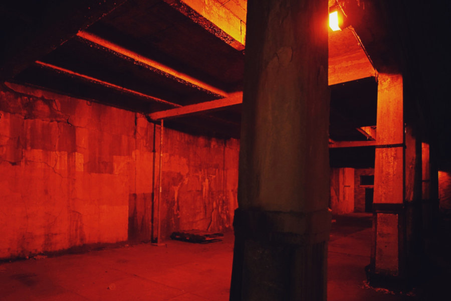
New brutalism, inevitably, in global dissemination, degenerated into a rough concrete style.
Description Lists
Unordered Lists
ul.disc
ul.diamond
ul.fisheye
ul.check
ul.heart
ul.circle
ul.triangle
ul.bullseye
ul.xmark
ul.sparkle
ul.square
ul.brutal
ul.lozenge
ul.arrow
ul.burst
ul.tags - makes ul li items display inline
ul.tags-hash - prepends a hashtag to tags
ul.tags-check - prepends a checkmark to tags
ul.tags-xmark - prepends an x-mark to tags
Ordered Lists
Default
ol.roman
ol.alpha
ol.none
Section Header Counter
The section header counter allows you to create auto-incremented section headers and sub-headers.
Classes
.count h(1-5) - auto-increments H tags (1-5)
.subcount h(2-6) - auto-increments H tags (2-6)
.count-reset - resets count to 0
.subcount-reset - resets sub-count to 0
Counted heading tags need to be wrapped within a count class div. Sub-headings need to be wrapped within a subcount class div (that is also nested within a count element).
									<div class="count">

									 <h2>Heading</h2>

									 <h2>Heading</h2>

									  <div class="subcount">

									    <h3>Sub-heading</h3>

									    <h3>Sub-heading</h3>

									    <h3>Sub-heading</h3>
    ...

									  </div>

									 <h2>Heading</h2>
...

									</div>
Apply these classes to paragraphs or divs to create a multi-column layout.
.col2 - 2 column layout
Lorem ipsum no facer prompta vim, movet ubique qui ei. Per no regione aliquid, ea mei nulla scribentur liberavisse. Vim cu tale ludus possit, discere suavitate nam ad. No verterem reprimique vix, phaedrum hendrerit an quo. Qui feugait apeirian ut, ne virtute numquam mandamus mea. Eos et enim dicant deterruisset. At nec ceteros mentitum, ex solum putent offendit per.
.col3 - 3 column layout
Lorem ipsum no facer prompta vim, movet ubique qui ei. Per no regione aliquid, ea mei nulla scribentur liberavisse. Vim cu tale ludus possit, discere suavitate nam ad. No verterem reprimique vix, phaedrum hendrerit an quo. Qui feugait apeirian ut, ne virtute numquam mandamus mea. Eos et enim dicant deterruisset. At nec ceteros mentitum, ex solum putent offendit per.
.col4 - 4 column layout
Lorem ipsum no facer prompta vim, movet ubique qui ei. Per no regione aliquid, ea mei nulla scribentur liberavisse. Vim cu tale ludus possit, discere suavitate nam ad. No verterem reprimique vix, phaedrum hendrerit an quo. Qui feugait apeirian ut, ne virtute numquam mandamus mea. Eos et enim dicant deterruisset. At nec ceteros mentitum, ex solum putent offendit per.
More Column Classes
.col5 - 5 columns
.col6 - 6 columns
.col7 - 7 columns
.col8 - 8 columns
.col9 - 9 columns
Column Gaps - Add 10, 20, 30, 40, 50, or 60px gaps between columns
.gap10
.gap20
.gap30
.gap40
.gap50
.gap60
EXAMPLE: White justified arial text within a 3-column layout with 30px gaps between columns, with double spacing and an indent.
<p class="white-t justify arial triple-col gap30 dbl-spaced indent">...</p>
These classes are used for brutalizing your content. Apply them to any element.
Scale Classes
.enlarge - Enlarges container size by 50%
.scale-2x - Doubles size of container
.scale-3x - Enlarges container 3x
.scale-4x - Enlarges container 4x
.shrink - Reduces container size by 25%
.half-size - Reduces container to half it's original size
.quarter-size - Reduces container to 25% of original size
Scale on hover: append a -h to any of the above scale classes. (ex. .scale-3x-h)
Skew Classes
.skew - Skews container to left
.skew-right - Skews container to right
.perspective - Angles container to the left
.perspective-right - Angles container to the right
Transformation Classes
.flip - Flips container horizontally
.flip-h - Flip horizontally upon hover
.flip-up - Flips container vertically
.flip-up-h - Flips vertically upon hover
Spacing Classes
.padded - 1em padding
.no-pad - No padding on container
.comfortable - 3.33em padding
.uncomfortable - Negative 1.75em padding
.solitary - 3.33em margins
.sociable - Negative 2.25em margins
.paranoid - 1.75em margins on left and right
.isolated - 1.75em margins on top and bottom
.confined - Absolutely NO padding or margins
.spacer - Empty block 2.5em (40px) tall
.spacer-tall - Empty block 6em (96px) tall
Rotation Classes
Rotate elements x degrees either to the left or right:
.rrX - rotate right X degrees
.rlX - rotate left X degrees
X values start at 5, and increment by 5 up to 90.
.rr5, .rr10, .rr15, ... .rr90
.rl5, .rl10, .rl15, ... .rl90
Rotate on Hover
Elements can be rotated upon hover. Simply add a -h to a rotation class:
.rr45-h
.rl10
I am rotated to the left 10 degrees.
.rr25 .rl35-h
I am rotated to the right 25 degrees.
I also rotate left 35 degrees upon hover!
Use these classes to apply filters to any element.
Original Image
NOTE: It is NOT possible to apply multiple filter classes to the same element.
.invert
.grayscale -d
.sepia -d
.contrast -d / -i
.hue -d / -i
.saturate -d / -i
.darken -d / -i
.lighten -d / -i
.blur -d / -i
Simply append -i or -d to a filter class to increase or decrease the affect a filter has on an element.
-i (increases filter affect)
-d (decreases filter affect)
Examples:
.contrast-i (increase contrast)
.hue-d (decrease hue)
NOTE: Not all filter classes support increasing or decreasing a filter. See the list of filter classes above to see what classes support -i and -d.
Apply a filter upon hover simply by adding -h after the class.
Examples:
.invert-h
.darken .hue-i-h
Make elements have opacity, or force a transparent background (ideal for PNG images).
Transparent background.

75% opacity.
50% opacity.
25% opacity.
Renders element invisible upon hover.
Makes element 75% opaque upon hover.
Makes element 50% opaque upon hover.
Makes element 25% opaque upon hover.
Use these classes for borders and horizontal rule separators.
Basic Borders
Basic borders can have flavors applied! Check out Flavors to see how to change the border color.
.b-s-t
Solid thin border
.b-s-k
Solid thick border
.b-s-f
Solid fat border
.b-d-t
Dotted thin border
.b-d-k
Dotted thick border
.b-d-f
Dotted fat border
.b-a-t
Dashed thin border
.b-a-k
Dashed thick border
.b-a-f
Dashed fat border
.b-b-t
Double thin border
.b-b-k
Double thick border
.b-b-f
Double fat border
Outlines
Add an outline border around any element. You can apply both borders and outlines to the same element. Similar to the border classes above, use o in place of b. Below are some examples.
.b-s-t .o-a-k
Solid thin red border with thick dashed blue outline
.o-d-k .os-5
Strawberry banana box with chocolate outline, offset by 5px
.o-d-t .b-s-t
.b-a-k .o-s-t .os-5 .rounded
.b-a-t .o-a-t .os-2
Offset Outlines
Offset outline borders by 2, 5, 10, 15, or 20px. Use these classes:
.os-2
.os-5
.os-10
.os-15
.os-20
Horizontal Rules
hr.jagged-rule-dark
hr.jagged-rule-light
hr.cut-light
hr.cut-dark
hr.thick.tomato
hr.thick.lush
Special Borders
.love-b
.lush-b
.virgin-b
.frost-b
.sunset-b
.dusk-b
.shades-b
.river-b
.hottie-b
.brutal-border-dark
.brutal-border-light
.bevel
.emboss
.jagged
Creates a grey triangular border above and below an element.
.jagged2
Jagged alternative
Shapes
.circle
.sketchbox
.rounded
Apply these classes to add a box shadow. By default, box shadow colors are black, so to change the box shadow color, you will need to edit the colors in the core butch.css file.
.box-s
.box-s-k
.box-s-f
.box-s-d
.box-s-t
.box-s-q
.box-s-p
.box-s-s
.box-s-l
.box-s-r
.box-s-a
.box-s-b
Tables can be made responsive simply by applying the class .responsive directly to the table tag. On devices under 600px wide, each table row is displayed as a record. Re-size your browser window to see it in action.
| Client | Due Date | Amount | Status |
|---|---|---|---|
| Ma Pa Shop | 08/20/2017 | $1,165 | Paid |
| Creative Studio | 02/01/2015 | $2,167 | Collections |
| Food Bistro | 04/30/2020 | $978 | Good Standing |
| Repair Shop | 02/15/2019 | $15,500 | Unpaid |
To make an image fluid width so that it fits within any area, simply apply the class: .responsive
© Brutalist Framework
Use the video tag, and the video will be fluid-width. If embedding a YouTube, Vimeo, or any other third-party video that uses an iframe, simply wrap the iframe embed code within a div with class .video.